If your room feels almost there—like the sofa is fine, the rug is fine, the lamps are fine—but the whole space still feels a little… temporary? That’s usually a wall-art problem. Not because you don’t have enough art, but because you don’t have the right art doing the heavy lifting.
The good news: you don’t need a gallery wall, a full redesign, or a perfect house. You need one strong “anchor” piece (or a simple set), and a few basic rules that keep everything from feeling random.
Quick Picks (save this)
- Start with one hero print for your main wall. Let it set the mood.
- Pick 2–3 dominant tones (not every color you like).
- Match warmth (warm vs cool) before you match exact colors.
- Choose frames with a little weight (thin frames often read cheaper).
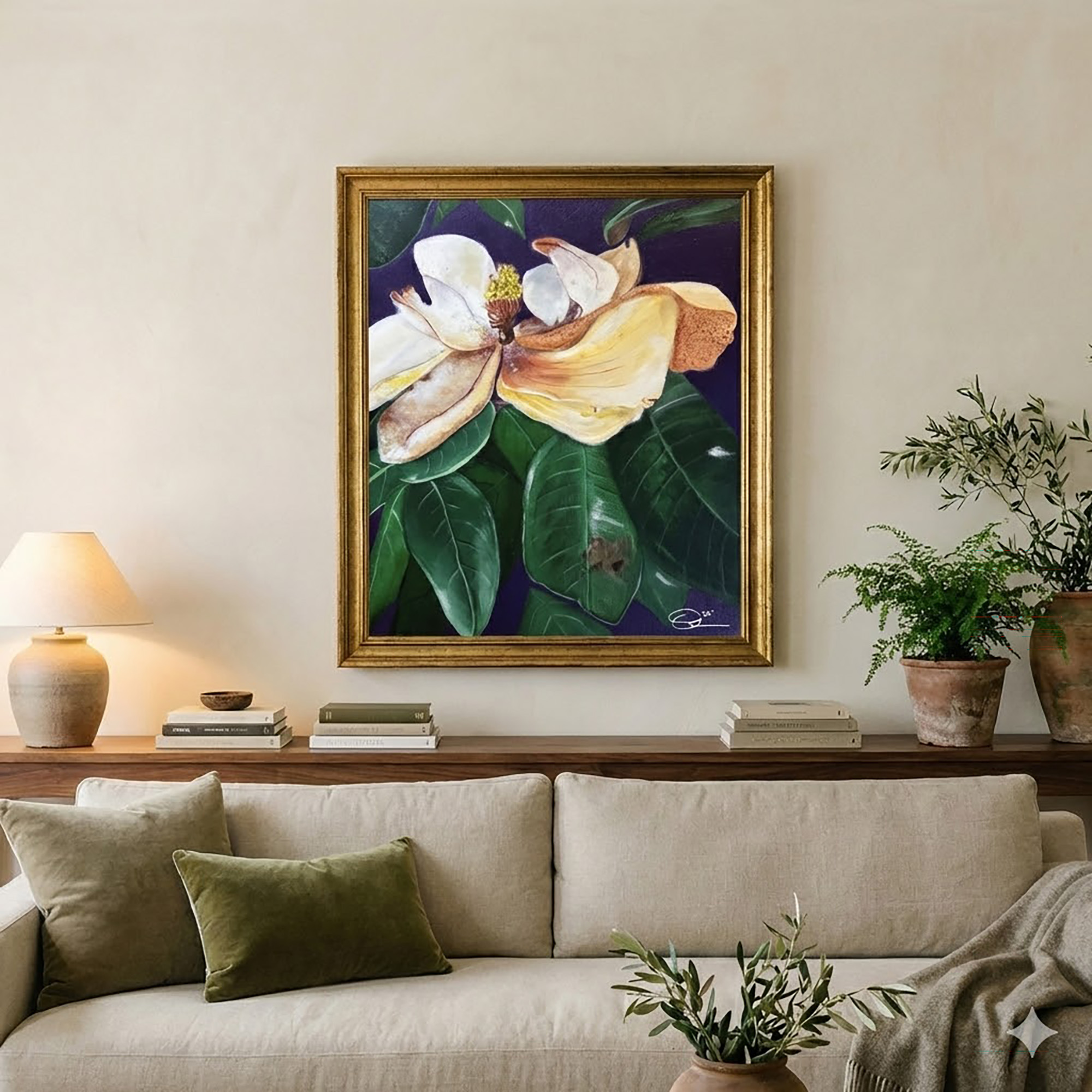
- Hang art at a human height, not “almost touching the ceiling” height.
1) Start with one wall that matters
There’s always a wall that does the most work: over the sofa, over the bed, the dining wall you see from the entry, or the hallway you walk through twenty times a day. That’s your anchor wall.
If you try to “pepper in” small prints everywhere first, the room doesn’t click. It just looks like you’re collecting—without editing. (Collecting is good. Unedited collecting is where it gets messy.)
Your move: choose the wall you want to feel finished first, then pick art for that wall before anything else.
Shop the anchor pieces (prints):
→ [Add your Still & Drift Etsy wall art prints collection link here]
2) Choose scale like you mean it
Most people buy wall art that’s too small because it feels safer. I get it. Big art feels like commitment.
But small art over a big piece of furniture can make the room feel oddly unfinished—like you meant to do something bigger later.
Here’s a simple guide you can trust:
Over a sofa:
- Aim for art that’s about 2/3 the width of the sofa (or a set that spans that width).
Over a queen bed:
- One larger piece works beautifully, or a calm pair with breathing room.
Dining wall / entry wall:
- A single statement print is often stronger than a busy grid.
If you’re not sure, tape paper to the wall first. Use painter’s tape. Ugly? Yes. Effective? Also yes.
3) Pick 2–3 tones, then stop
This is the part that makes a room feel “collected” instead of chaotic.
Look at your room and identify:
- one ground tone (often a neutral: cream, sand, warm gray, taupe)
- one deep tone (walnut, espresso, olive, charcoal, deep teal)
- one accent (rust, ochre, burgundy, muted blue)
That’s it. If your art brings in all three—done. If it brings in two and your textiles bring in the third—also done.
What doesn’t work as well is trying to include every color you love in one room. That usually reads as “Pinterest board,” not “home.”
4) Match warmth before you match color
If you only remember one thing from this post, make it this:
Warm + warm = easy. Cool + cool = easy. Warm + cool = tricky.
Warm rooms feel like: camel, cream, chocolate, ochre, olive, brass.
Cool rooms feel like: bright white, icy gray, crisp black, cobalt, stark navy.
Still & Drift lives in the warm world—those lived-in luxury tones that feel calm and rich without being precious. If your room leans cool right now (lots of bright white, steel, blue-gray), you can still make it work. Just bridge it with:
- warmer frames (walnut / brass)
- warmer mats (soft cream instead of bright white)
- a print that includes both a cool note and a warm grounding tone
5) Frames are the quiet “luxury” lever
A frame can make a print look expensive, or… not. This is where a room gets its polish.
If you want lived-in luxury:
- walnut / warm wood frames
- antique gold (not shiny yellow gold)
- soft black with some thickness (thin black frames can read dorm-room)
Mat tip: choose a mat that’s warm white or cream. Bright white mats can look harsh in warm rooms.
Also: you don’t need museum glass for everything. But if your space gets a lot of sun, it’s worth considering a UV option for the pieces you keep forever.
6) If you want it to look “done” fast, use a set
Sets remove decision fatigue. They also create instant cohesion without you having to be an art curator.
A simple formula that works:
- 1 hero print + 2 supporting prints
- Keep the supporting prints calmer (less contrast, fewer colors)
- Let the hero piece carry the drama
This is especially good if your furniture is still evolving. The art creates the mood while the rest catches up.
Shop print sets / postcard sets:
→ [Add your Still & Drift Etsy sets link here]
7) When digital prints make the most sense
Digital prints are underrated for one reason: they let you test a room direction without the pressure.
Use digital when:
- you’re styling a new space and want to “try on” a mood
- you want seasonal swaps (warmer in fall/winter, lighter in spring)
- you need something fast (same day, no shipping)
The key is printing well: matte paper, correct size, and a frame that has some weight.
Shop digital prints:
→ [Add your Still & Drift digital prints link here]
Style Notes (the “collected home” finish)
- One strong piece is better than five apologetic ones.
- A room can be imperfect and still feel intentional.
- Warm tones + a little depth = instant lived-in luxury.
Pinterest overlay lines (use these on pins)
- The 5 Wall Art Rules
- Why Your Room Feels Unfinished
- Stop Buying Prints That Are Too Small
- The Anchor Piece Method
- Frames Matter More Than You Think
- How to Pick Art Colors
- A Collected Look Fast
- Print Sets Made Easy
- Digital Prints That Don’t Look Cheap
- Lived-In Luxury Wall Art Guide