Neutral kitchens are having a moment—and honestly, I get it. A calm kitchen feels like a deep breath. But sometimes neutral starts to look less “serene” and more “we all collectively forgot joy exists.”
As a painter, I’m legally obligated to bring a little color back into the world. As a person who loves a clean, elevated home (and doesn’t want to spend her life dusting tiny decorative objects), I’m also here to do it without turning your counters into a HomeGoods obstacle course.
The goal: color that feels intentional, high-end, and easy to live with—the kind of kitchen that looks pulled together even when there’s a rogue lunchbox on the island.
The rule that changes everything: choose “color anchors,” not “color stuff”
Clutter happens when color arrives in a hundred random forms: a bright utensil crock, a novelty sign, three seasonal towels, four impulsive candles, and a suspicious rooster.
Instead, pick 1–3 color anchors—repeat them strategically—and let the rest of the kitchen stay calm.
Think:
- one standout art moment
- one textile moment
- one functional object that earns its counter space
That’s it. Three moves. No chaos.
Step 1: Pick a color story that looks expensive (not loud)
Here’s the secret: “color” doesn’t have to mean “neon.” Some of the most gorgeous color is deep and moody and grown-up.
A few foolproof “quiet luxury” palettes:
- olive + ivory + warm wood
- ink navy + soft white + brass
- rust + linen + walnut
- aubergine + cream + black accents
- sage + stone + natural oak
Choose one palette and stick to it like it’s your job.
This is exactly how premium brands build cohesion: not by adding more things, but by repeating a tight aesthetic so everything looks intentional.
STILL & DRIFT – Winning Custome…
Step 2: Make art the main character (because it’s color and “not clutter”)
If you want color without mess, wall space is your best friend.
A single piece of art (or a small, curated pair) does more than ten countertop objects ever could. It adds:
- saturation
- personality
- a focal point that makes the whole room feel styled
Pro tip from an artist who has learned this the hard way:
If your kitchen is neutral, choose art with one strong hue and a lot of breathing room—dark backgrounds, creamy margins, simple shapes, or a bold subject on a quiet field. That’s how you get impact without visual noise.
Step 3: Add color where your eye already rests
You don’t need color everywhere. You just need it in the places your brain naturally lands:
1) The sink zone
- a beautiful hand soap + lotion set in your palette
- a single linen towel (not six… I see you)
2) The coffee/tea zone
- one tray that corrals the items
- a mug set in one consistent tone (matte glazes look especially elevated)
3) The stovetop zone
- a dutch oven in a deep color (navy, forest, oxblood = chef’s kiss)
- a single utensil crock in a neutral material (wood/stoneware), not rainbow silicone
Color looks more expensive when it’s contained.
Step 4: Upgrade “boring” surfaces with tiny hits of color
These are the stealthy, high-payoff upgrades:
- cabinet hardware (warm brass instantly warms neutrals)
- a runner (vintage-style patterns hide life and add richness)
- counter stools (upholstery is color without clutter)
- a Roman shade (softens the room and adds texture)
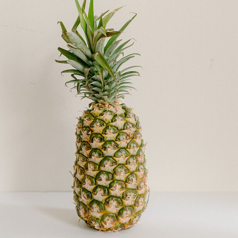
- a bowl of real fruit (seasonal color that disappears when it’s eaten—perfect)
Again: color that earns its keep.
Step 5: Repeat, repeat, repeat (this is what makes it look “designed”)
Here’s the formula designers use (and artists secretly use too):
Repeat the same color at least 3 times in a room.
Example: you choose deep green.
- green in the art
- green in one towel or shade
- green in a bowl, cookbook spine, or stool fabric
Now it looks like a plan, not a shopping spree.
Step 6: The “clutter filter” (ask this before you bring anything home)
If you want a kitchen that feels elevated, run every colorful item through this filter:
Does it do at least one of these?
- solves a problem
- gets used daily
- makes the room feel finished (in a big way)
If it doesn’t pass, it’s probably future clutter pretending to be decor.
And if you’re shopping for a more premium, time-saving lifestyle (which—let’s be real—is what most of us actually want), this filter keeps your space and your brain calm.
STILL & DRIFT – Winning Custome…
A simple “Still & Drift” way to think about it
- STILL is your foundation: quiet neutrals, calm surfaces, visual breathing room.
- DRIFT is your color: intentional, artful pops that feel personal.
You don’t need to choose between “neutral kitchen” and “colorful kitchen.”
You need a neutral kitchen with a pulse.
If you want an easy starting point
Do this one thing:
- Pick a palette (navy? olive? rust?)
- Add one piece of art in that palette
- Repeat the color twice with functional items (a towel + a bowl, for example)
That’s color. That’s cohesion. That’s not clutter.
And yes: it will still look good when someone leaves a backpack on the chair.