If you love the idea of a gallery wall but hate how busy most of them feel, a simple set of two or three prints is the calm alternative. Done right, it makes a room feel finished fast—without looking staged or overly coordinated.
Why print sets work so well
Sets remove decision fatigue. Instead of trying to curate a wall piece by piece, a set gives you built-in cohesion — scale, spacing, and color already considered.
They’re especially helpful if:
- your furniture is still evolving
- you want a fast upgrade that feels thoughtful
- you’re decorating a rental or secondary space
A good set feels collected over time, even if you hung it in one afternoon.
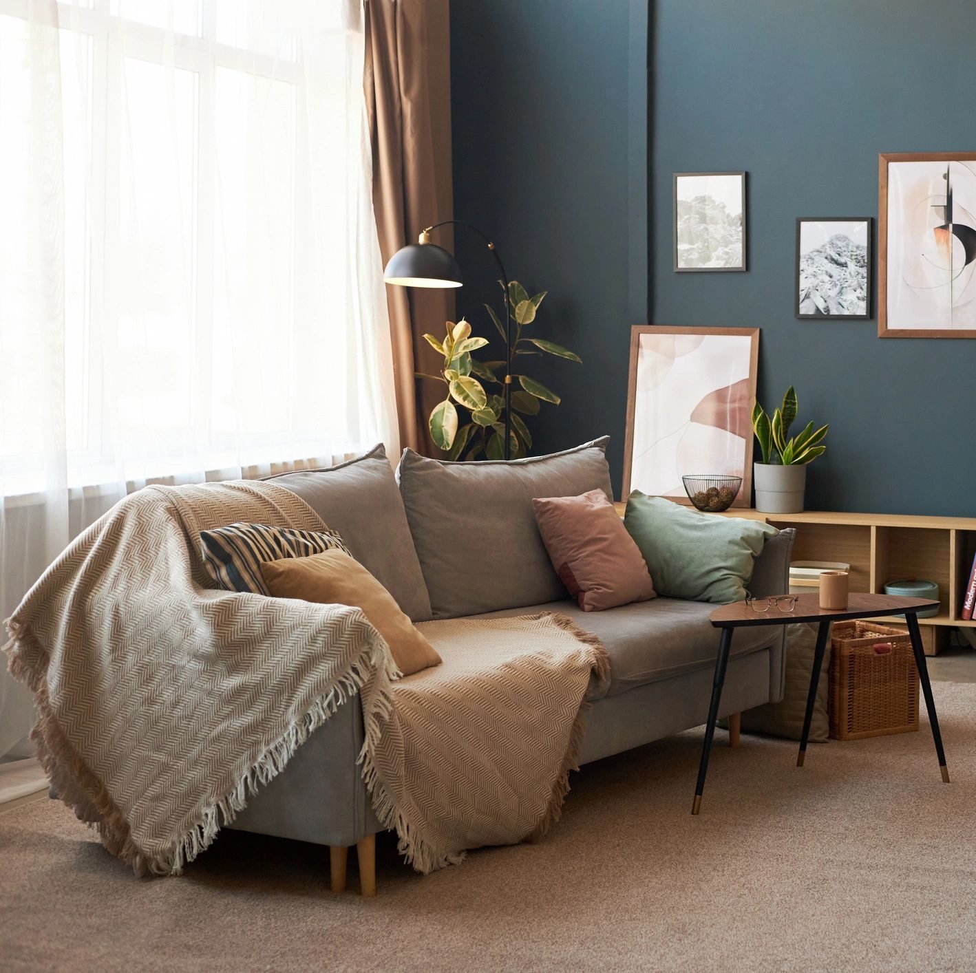
The core formula: 1 hero + 1–2 supporting prints
This is the easiest way to avoid a “matchy” look.
- Hero print: carries the contrast, movement, or emotional weight
- Supporting prints: quieter, simpler, less contrast
Think of it like getting dressed: one statement piece, everything else balances it.
If all the prints shout, the wall feels noisy. If one leads and the others echo, the room settles.
Three pairing styles that always work
1) Same subject, different moments
Examples:
- fruit still lifes in slightly different compositions
- botanicals at different scales
- abstracts from the same series
This works because the language is the same, even if the images aren’t.
Best for: dining rooms, kitchens, hallways
2) Same palette, different subjects
Examples:
- one still life + one abstract
- one botanical + one atmospheric piece
As long as the colors agree, the subjects don’t have to.
Best for: living rooms, bedrooms, mixed-use spaces
3) Same mood, varied detail
Examples:
- one detailed piece + one softer, more minimal piece
- one darker grounding print + one lighter companion
This creates rhythm without repetition.
Best for: bedrooms, reading nooks, calm spaces
Size + spacing: where most people go wrong
A set looks expensive when it has room to breathe.
General rules:
- Keep spacing consistent (2–3 inches is a sweet spot)
- Don’t cram small prints onto a large wall
- Let the set span about 2/3 the width of the furniture below it
If it feels slightly larger than you expected, you’re probably doing it right.
Frames: coordinated, not identical
Matching frames can work — but they’re not required.
For a lived-in luxury look:
- stay in the same family (all warm wood, or all antique metal)
- vary profile width slightly
- avoid mixing ultra-modern with heavily ornate
The goal is harmony, not uniformity.
When to choose a set over a single large piece
Go with a set if:
- the wall is wide but low
- you want visual movement across the space
- the room already has a lot of solid furniture mass
Choose a single large piece if:
- you want one clear focal point
- the wall is tall and narrow
- the room already feels busy
There’s no “right” choice — just the one that supports the room.
Using postcard sets as mini print sets
Postcard sets work the same way, just at a smaller scale.
Try them:
- in a tight grid
- leaned on a shelf or rail
- layered with one larger framed print
They’re perfect for experimenting before committing to larger sizes.
Shop print sets / postcard sets:
→ [Add your Still & Drift Etsy sets link here]
Style Notes (the collected look)
- Repetition is quiet; variation is what makes it feel real.
- Leave space around the set — empty wall is part of the design.
- If you’re unsure, remove one piece. Less often looks better.
Pinterest overlay lines (use these on pins)
- The Print Set Formula
- How to Pair Art Without Matching
- 2–3 Prints That Actually Work
- The Calm Gallery Alternative
- Why Sets Feel Collected
- Stop Overthinking Your Walls
- A Finished Look, Fast
- How Designers Pair Prints