We love kitchen art, but we don’t love the kind that feels like it was chosen by a committee. Kitchens are busy, practical spaces—so the art that works best is usually smaller, warmer, and a little imperfect in a good way.
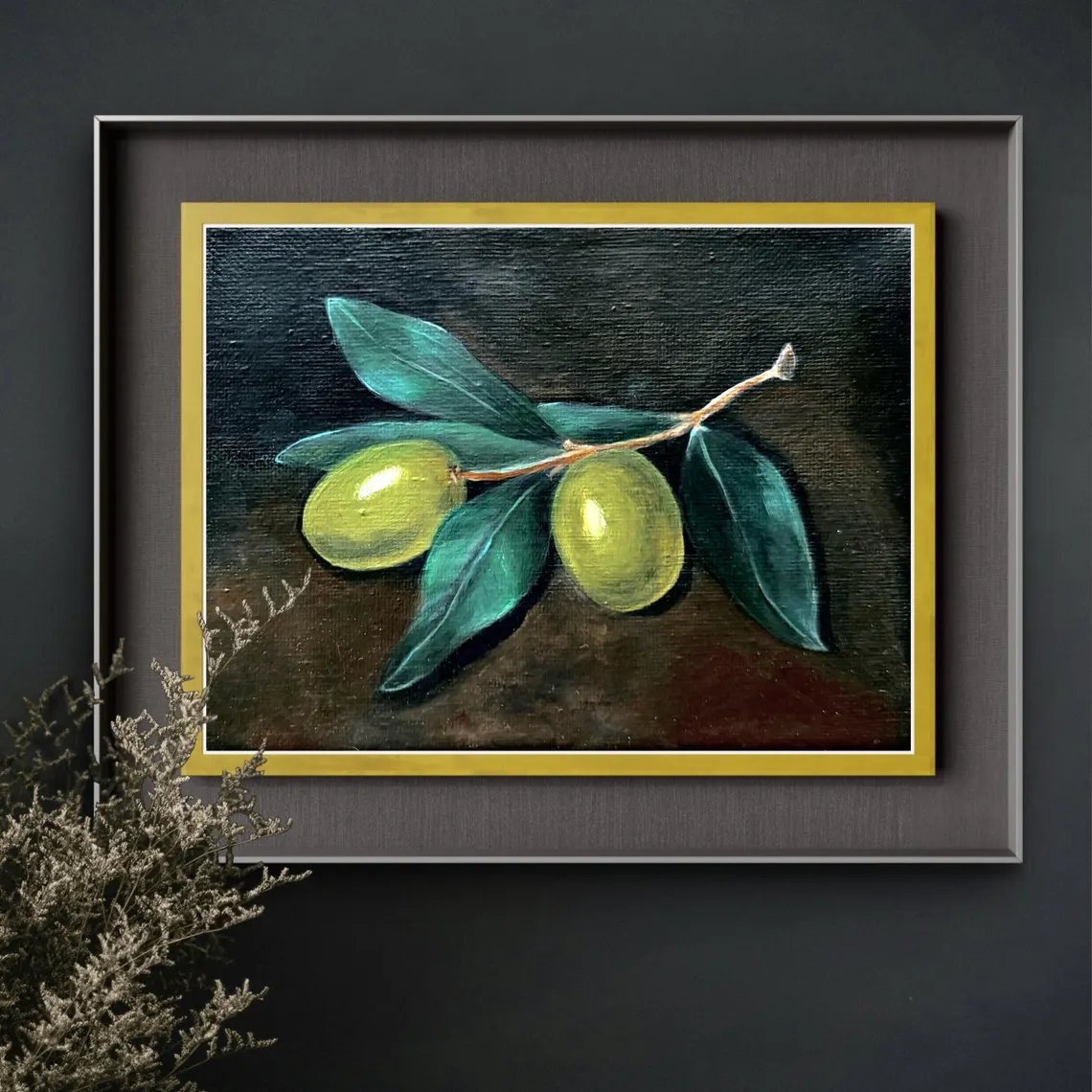
That’s why we’re big on small original still life paintings in kitchens. They’re humble. They don’t shout. And they make a kitchen feel like someone actually lives there.
Why small originals win in a kitchen
A kitchen already has a lot going on: cabinets, counters, appliances, backsplash lines, handles, cords… all of it. Big art can start competing with that visual noise.
Small art does the opposite. It’s like a little “pause” for your eyes.
And originals have a quiet kind of presence. Even a simple still life feels more personal than a big generic print, especially in a room where you’re in and out all day.
The 3 best places for 4×4 and 8×8 still lifes
You don’t have to hang everything perfectly centered. In a kitchen, casual placement usually looks better.
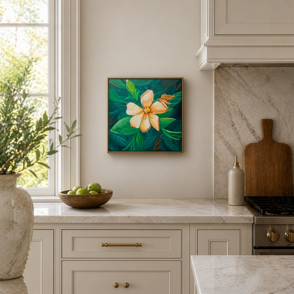
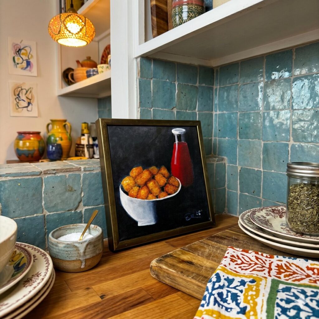
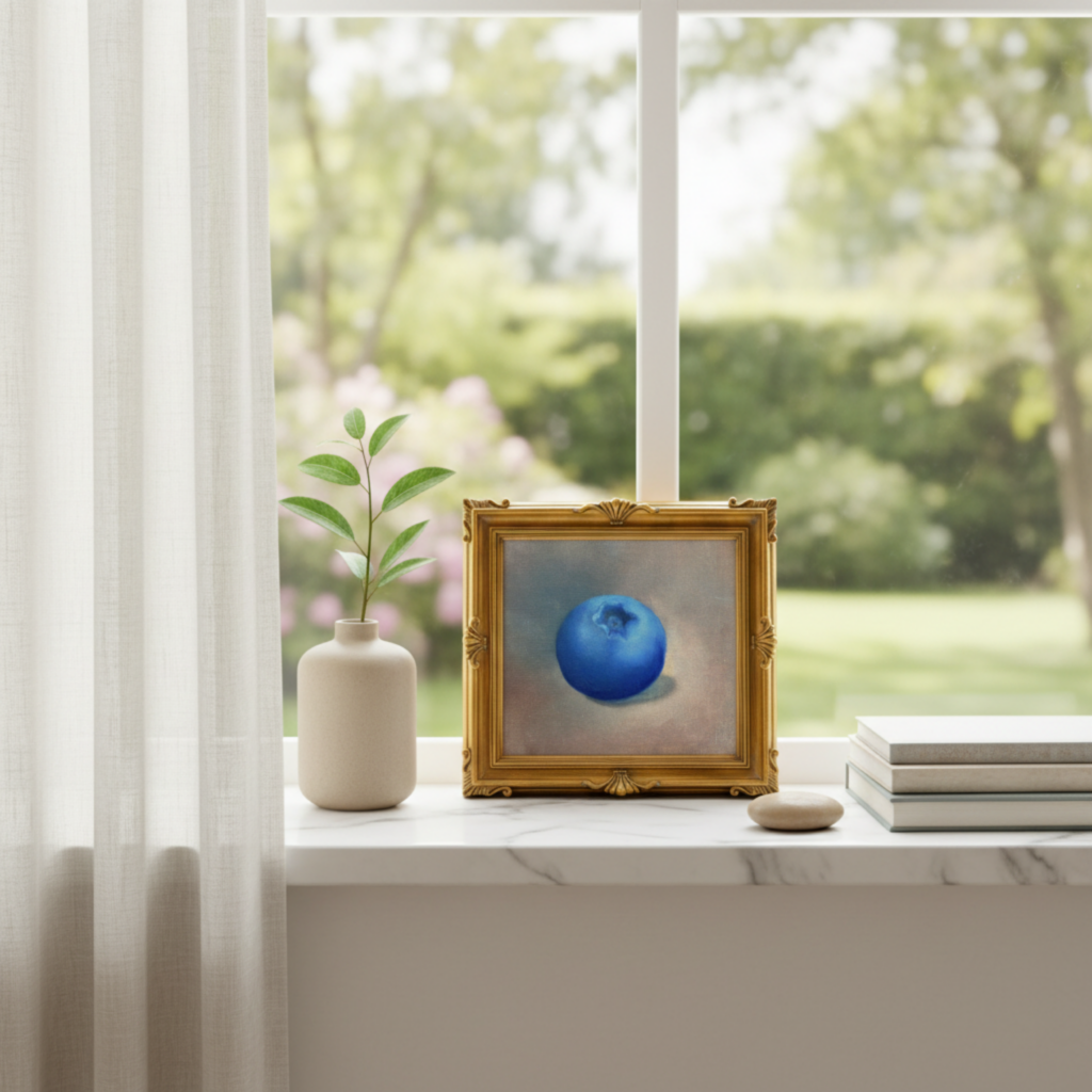
1) Lean it on a backsplash ledge (our favorite move)
If you’ve got any open counter space near the coffee corner, we’ll lean an 8×8 right against the backsplash. Add a mug and a cutting board nearby and it instantly looks “done.” No tray. No staged scene. Just normal life.
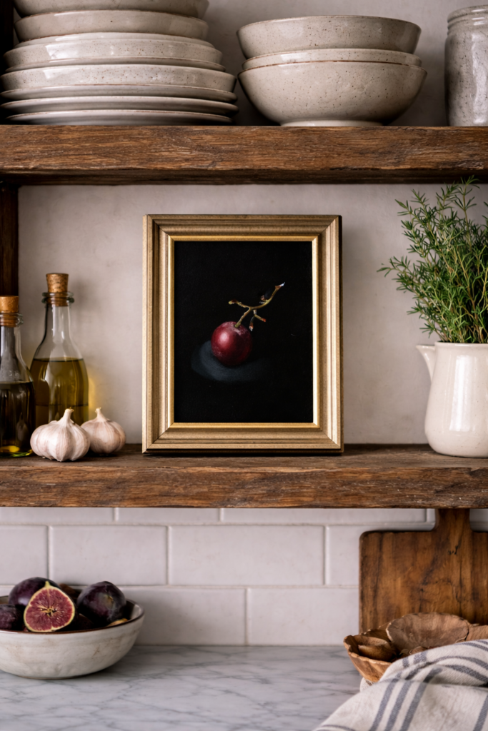
2) Open shelving / picture ledges
Small paintings look great leaned on shelves because they read collected, not decorated. An 8×8 works well here, and 4x4s are perfect tucked into a smaller gap between dishes and cookbooks.
3) The awkward skinny wall
Every kitchen has one weird narrow spot—near a pantry door, beside a window, by the breakfast nook. A 4×4 is basically made for that space. One tiny piece fixes a blank patch without turning it into a whole project.
What subjects look best in kitchens
Still life is kitchen-friendly by default, but some subjects feel especially natural.
What we reach for most:
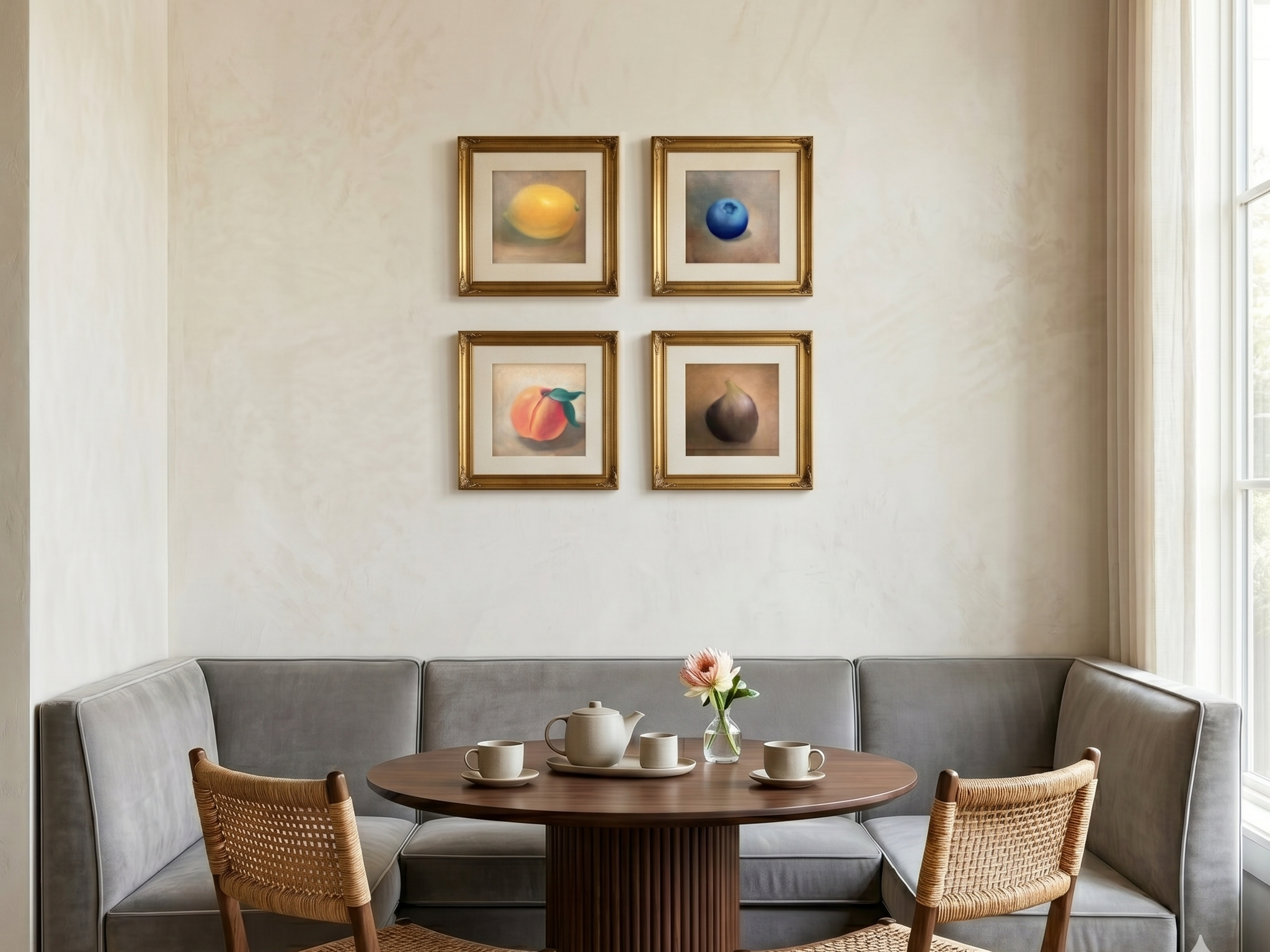
- fruit (citrus, berries, pears)
- simple florals (not huge bouquets)
- bowls, cups, bread, a single jar
- one object with breathing room (less clutter, more calm)
What we usually avoid for kitchens:
- super high-contrast graphics (can feel harsh next to busy counters)
- big portraits staring at you while you cook
- anything with quote-y text (it dates fast)
The “don’t make it clutter” rule
Small art can look messy if it’s surrounded by a million other things. The easiest fix is giving it a tiny bit of space to breathe.
Our quick rules:
- clear a small area around it (even 6 inches helps)
- pair it with one simple object (cutting board, bowl, plant)
- don’t do five tiny pieces in a row unless you’re committing to a real gallery moment
If we had to pick one foolproof combo, it’s this:
small painting + cutting board + one bowl. Done.
The 4×4 scale problem (and how we solve it)
4×4 is small. That’s the whole point—but people can’t picture it until they see it next to something normal.
So we always recommend showing at least one “scale proof” photo:
- the 4×4 next to a mug, OR
- held in a hand in the kitchen
It takes two seconds and it answers the question before anyone even asks it.
A real example (if you want one)
We make small original still life paintings that are meant for kitchens—easy to style on shelves, corners, and those “blank but not really blank” spots.
If you’re building a kitchen that feels warm and lived-in, start small. One tiny painting in the right spot does more than people think.